Hi there,
I have to admit I’m rather new to Grafana. I’ve tried to google my problem but probably just didn’t find the right phrase to get a solution…
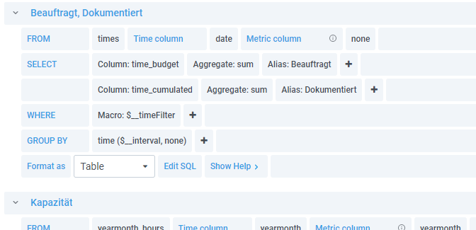
I have a query that returns three columns. Date, Budget, Documented.
SELECT
  $__timeGroupAlias(date,$__interval),
  sum(time_budget) AS "Budget",
  sum(time_cumulated) AS "Documented"
FROM times
WHERE
  $__timeFilter(date)
GROUP BY 1
ORDER BY $__timeGroup(date,$__interval)
I want to display the results in a graph, type “bar”. But: The two values “Budget” and “Documented” are displayed above each other. Resulting in the fact, that sometimes one of the bars is not visible if the value is lower than the other.
I just need an option to display both bars side by side. But I don’t find any so far. But somehow I can’t imagine this is not possible.
This is what it looks like at the moment in Grafana:
And this is what I want it to look like:
(Made with Redash that I actually want to replace with Grafana)
Any help is much appreciated!
Thx!
Edit: If another visualization type [that supports bars!] is more suitable I’m of course also open for that. Gauge looked promising, but I couldn’t get the order to work as I need it… That’s another topic…
Yes, Grafana 8 introduced some improvements regarding bar graphs. Once you have that set up, search the forums for how to group your data by month (there are several posts on that topic).
Let my IT department update Grafana to 8.2.5 did the trick More or less…
I can finally do the bars side by side, but I need transform the datetime to a string. Which results in the labels being unreadable as they are only numbers now. If I don’t do that transformation I end up with the message “Bar charts requires a string field”…